Data Privacy Clock
Digital Sketches
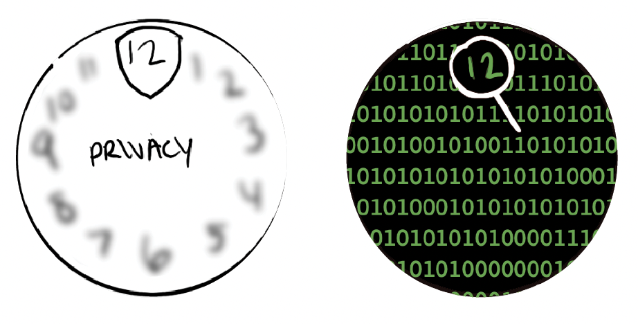
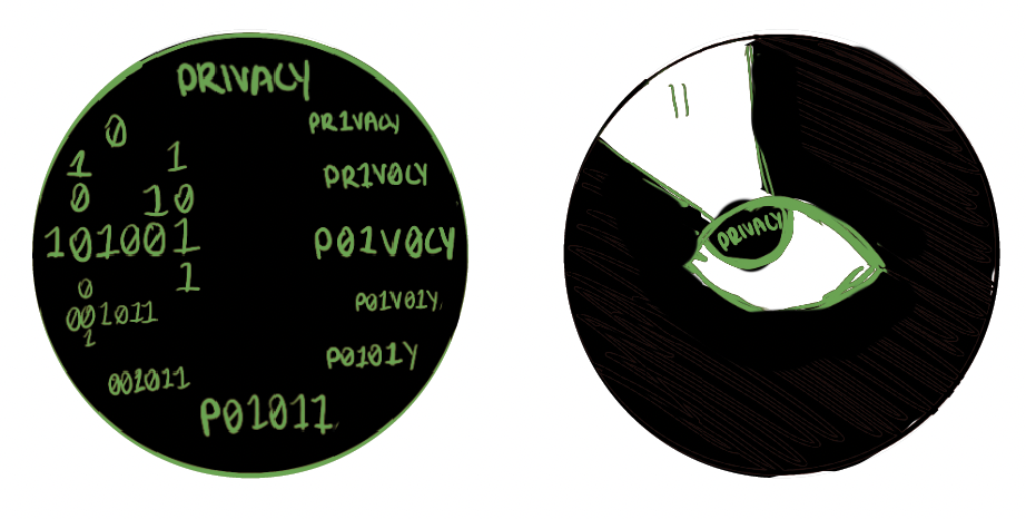
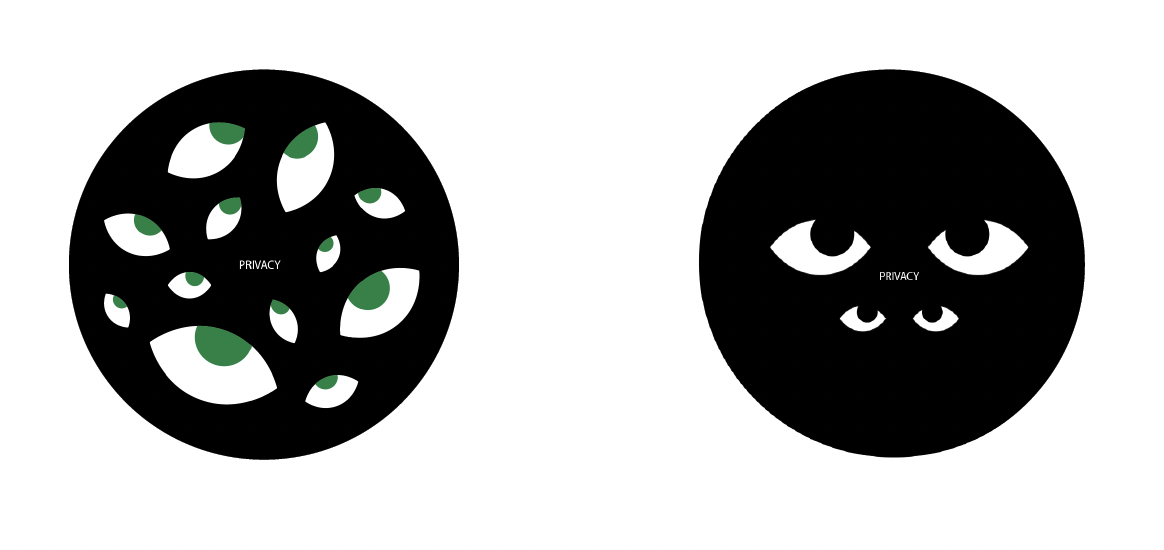
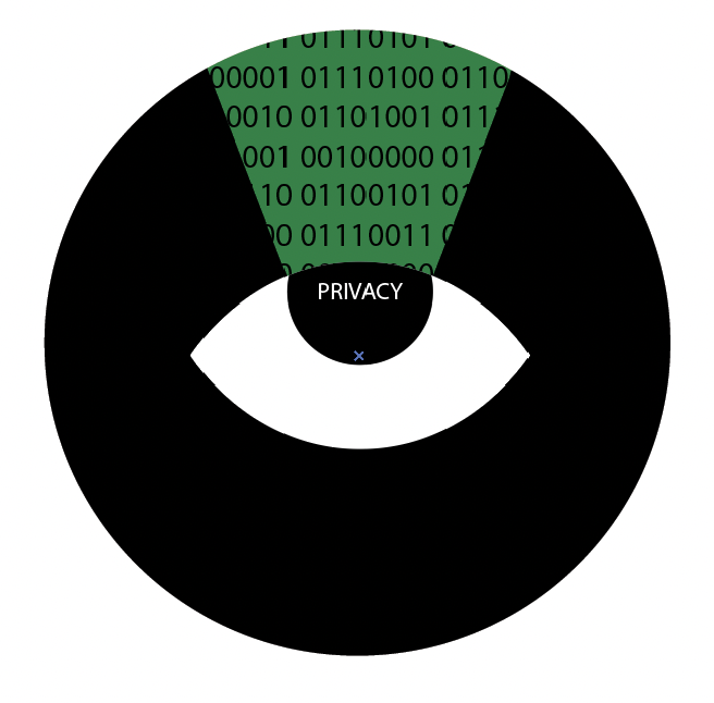
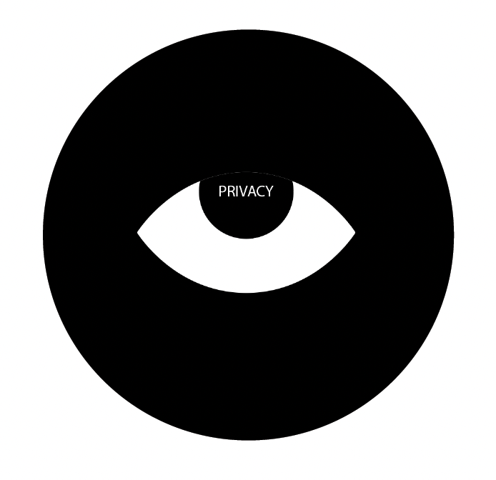
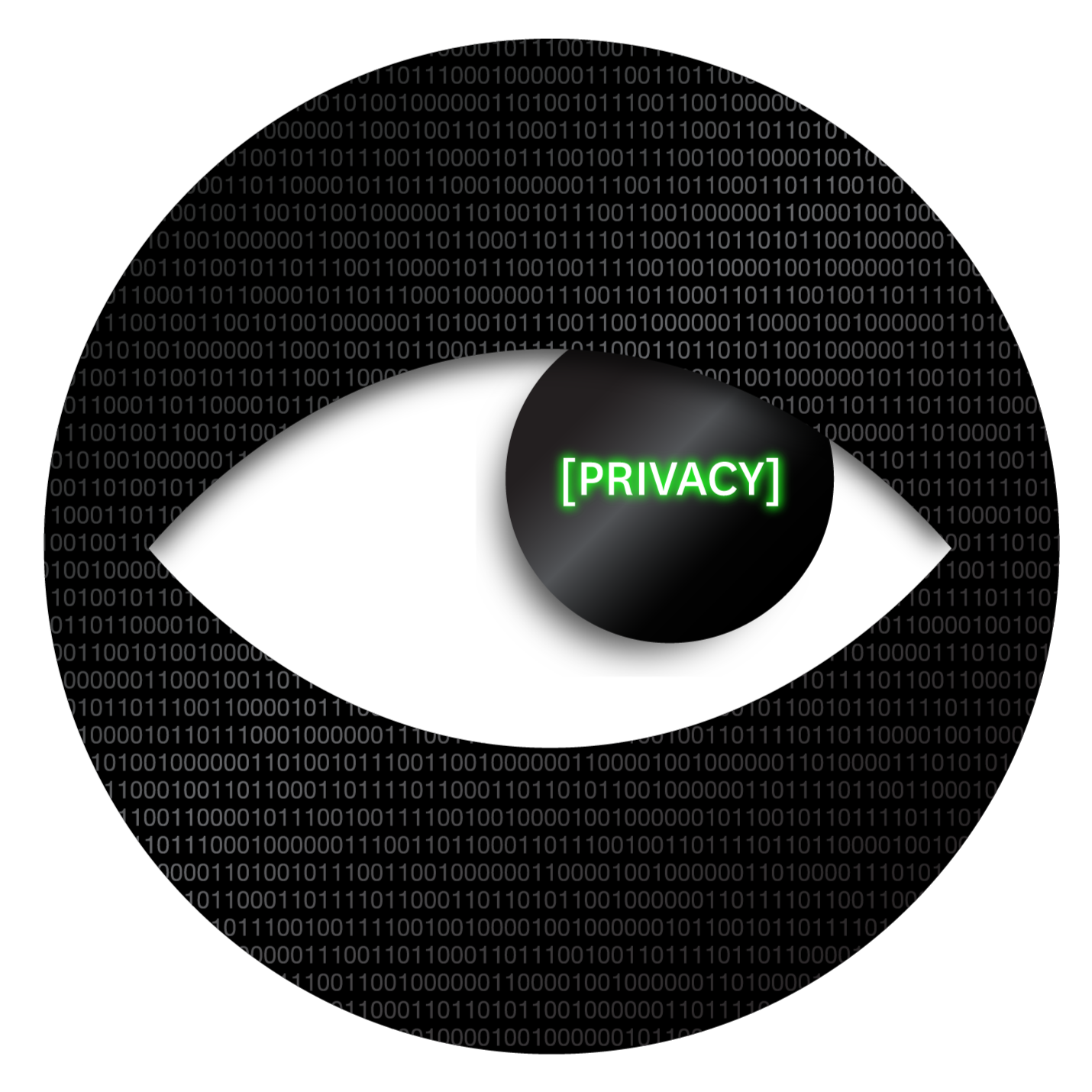
At its core, data privacy is about vulnerability. There is an almost instinctive unease that comes with the feeling of surveillance, which led to the recurring use of the eye as a visual motif throughout the clock design process.
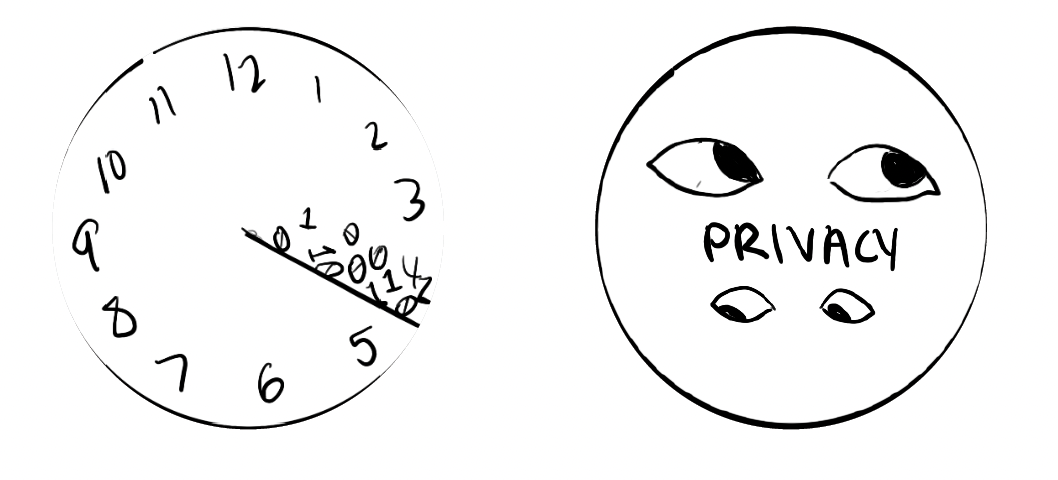
Final Clock
In the end, I chose the simplest concept I brainstormed; it felt like less is more in this context. I incorporated metallic textures and shadows to create a sense of depth and give the design a more three-dimensional feel. I also gave the main word a neon effect to highlight the irony of data exploitation, where we become more visible despite assuming our information is private.
Initial Sketches
In the early stages of designing the clock, I explored conceptual approaches that could meaningfully represent data privacy. I realized that the most impactful direction centered on the discomfort of being watched.